← Work/2024
TaxAct Simply State Flow
The screens looked fine. The architecture didn't.
- Role
- Senior UX Designer
- Year
- 2024
- Timeline
- ~6 months
- Tools
- Figma · FigJam · Tableau · Google Analytics
Pleasant UI
Clean screens. Clear copy. Nothing to flag.
Irrelevant questions
Topics most filers never needed to touch
Repetitive questions
Re-asking what the Federal return already captured
Momentum slowdown
State flow felt as long as Federal
IA organized around tax code, not users
Impact
- 8.7% lift in completion rate (4x the target)
- 90% fewer screens seen by users
- 42 months of engineering work saved
- Scaled from 2 states to 5 on early results
Nobody was looking at the architecture, but everyone was feeling it
You just finished your federal return. Steady progress, a refund number growing in the corner. You're in the zone.
Then the state section loads and asks for your address. Again.
Users who had built real momentum through the federal return hit the state flow and felt it evaporate. Same questions, irrelevant topics, no sense of progress. Something was wrong, but nothing on screen looked broken.
State abandonment was higher than federal. State filers were more likely to be repeat customers. Lose them here and you lose them for next year too.
Three data sources, one pattern
Instead of starting with opinions, we started with what the company had already collected.
Quantitative data showed us where.
Tableau dashboards and Google Analytics pulls identified the abandonment pages. We could see exactly which steps had the steepest drop-offs and where users were quitting.
Qualitative data showed us why.
Recorded user sessions told the story the numbers couldn't. We watched people lose momentum, re-answer questions they'd already completed, and give up on topics that had nothing to do with their situation.
A heuristic evaluation confirmed the pattern.
Pages were breaking basic usability principles, and the violations lined up with every spike in the quant data. Three independent signals pointing to the same conclusion.
When we cross-compared all three, one pattern hit immediately.
The sharpest drops concentrated in just two steps: Estimated Taxes and Contributions. Not broken pages. Not confusing layouts. Topics most filers had no reason to interact with at all.
The flow was asking questions users couldn't answer, and they were leaving instead of guessing.
The screens looked fine. The skeleton didn't.
Here's the thing that made this problem hard to see: individual screens weren't broken. The layout was fine. The copy was clear enough. If you looked at any single page, you wouldn't flag it.
The problem was structural.
What users saw
Clean layout. Clear copy. Nothing obviously wrong.
Irrelevant questions
Cause: The flow asked questions that had nothing to do with most users' situations.
Effect: Users lost faith that the product was smart enough to file their taxes accurately.
Repetitive questions
Cause: The state section re-asked for information users had already entered in the Federal section.
Effect: Users lost trust in the product's ability to accurately report to the IRS.
Momentum slowdown
Cause: The state flow felt as long as the Federal section. Users who had just finished a marathon were being asked to run another one.
Effect: Users felt stuck in a long flow they couldn't skip around.
Root cause: Information Architecture
Fixing the surface wouldn't help. The architecture itself had to change.
Mapping what nobody had mapped
Before changing anything, I mapped the entire California state flow screen by screen in Figma.
53 screens. The Credits section alone had more pages than some entire products. No wonder users felt lost.
From the map, three levers:
- Find the themes. Screens already clustered around income, deductions, and credits. The groupings existed, they just weren't named.
- Rename and reorder. Labels had to make sense to users, not the tax code. The sequence had to match how people think, not how the system was built.
- Gut-check feasibility. Engineering was in the room from day one, flagging what shipped clean and what needed workarounds.
A conservative target, on purpose
We believed that simplifying the state filing flow would reduce abandonment and increase NPS, measured by a 2% increase in completion rates for state-plus-federal users.
Two percent was conservative. Enough to justify the investment, grounded enough to be credible. We wanted a target nobody could argue against.
Three moves, one architecture
The fix wasn't one change. It was three coordinated moves across tech, content, and UX, all aimed at the same root cause.
Utilize existing data from the Federal section
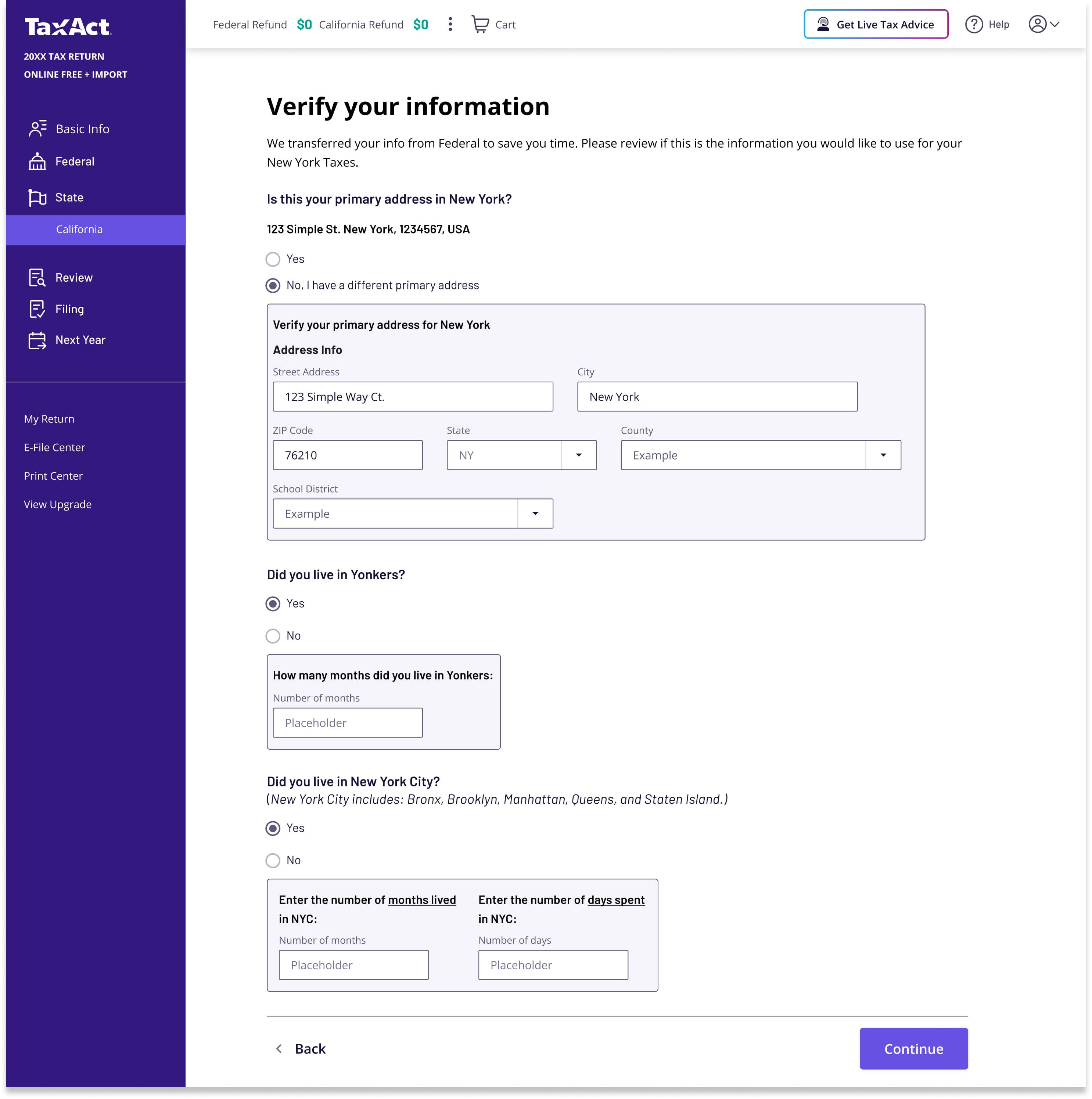
TechCarry over address, contact information, military enrollment, filing status, and deduction selection. Stop asking for what we already know.
Give users a homebase for each section
ContentExtend a familiar table pattern into a review hub. Users see what's on their return, what they can add, and what they can skip, all from one screen.
Have a smarter path for the user
UXConditionalize what users see based on their answers. Skip irrelevant credits entirely. Offer a clear exit with "None of the above."
Stop asking what we already know
TechThe state return wasn't communicating with the federal return. Users had already entered their address, contact information, military enrollment, filing status, and deduction selection. The state flow asked for all of it again, burying it in tax jargon that made the forms feel unfamiliar even though the information was the same.
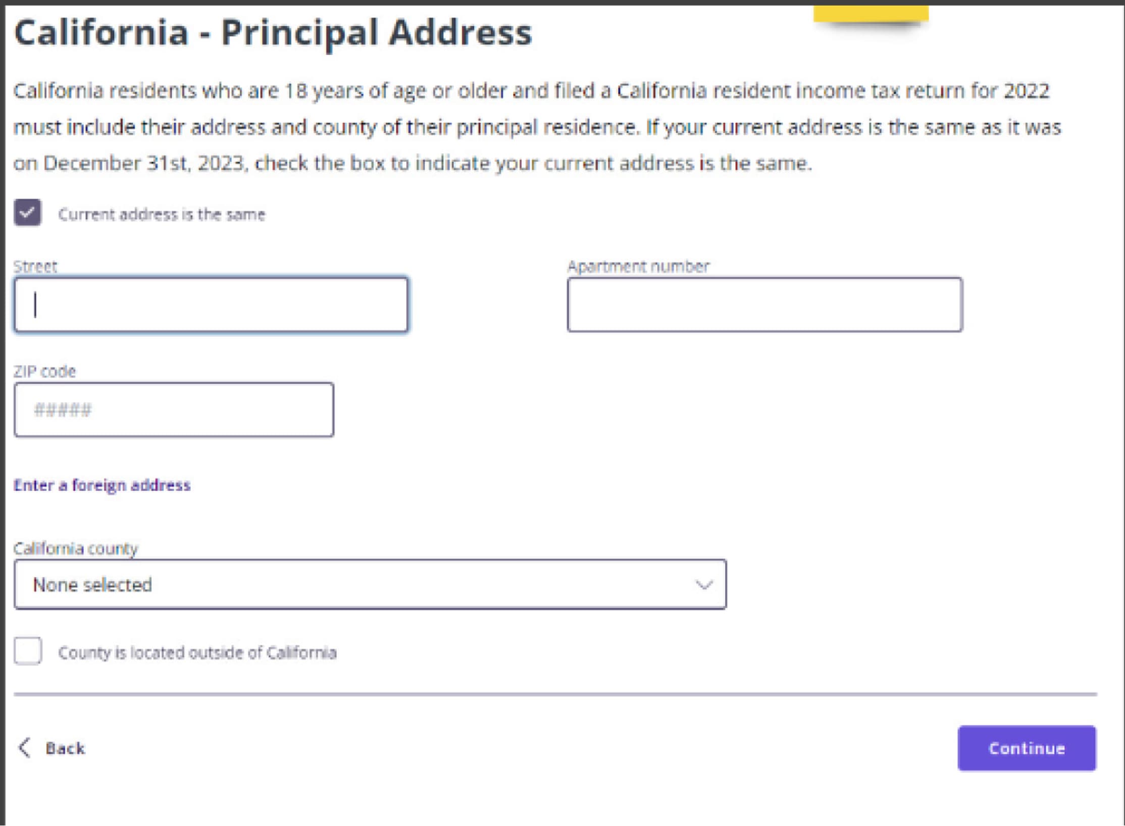
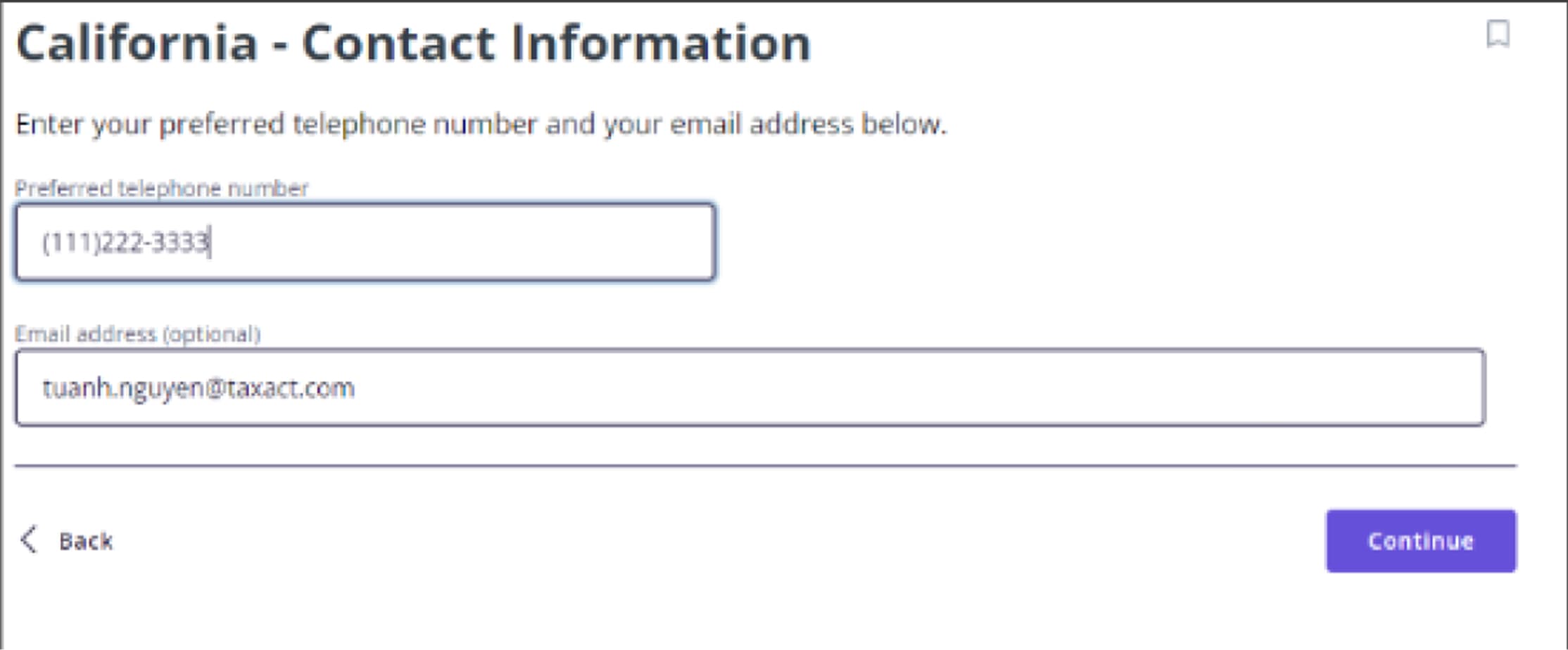
Instead of asking them to input everything again, we carried that data over and asked users to verify or edit. Reviewing information uses less cognitive load than re-entering it from scratch.
What verify-over-input unlocked
Lower cognitive load
Reviewing pre-filled information is less intensive than inputting it from scratch.
Fewer screens
Single-field screens collapsed into one Basic Info page. Less clicking, same coverage.
Tell them what's coming
ContentThe old state flow dropped users into a stream of isolated questions with no sense of where they were or what was left. Users needed a homebase: one screen per section that showed them what was on their return, what they could add, and what they could skip entirely.
The California Tax Summary already had a table layout that worked well for scanning line items. We extended that pattern into a review hub for each section of the state flow. One glance told users what was coming and how much was left.
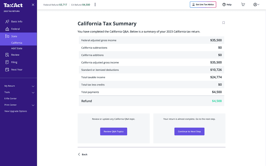
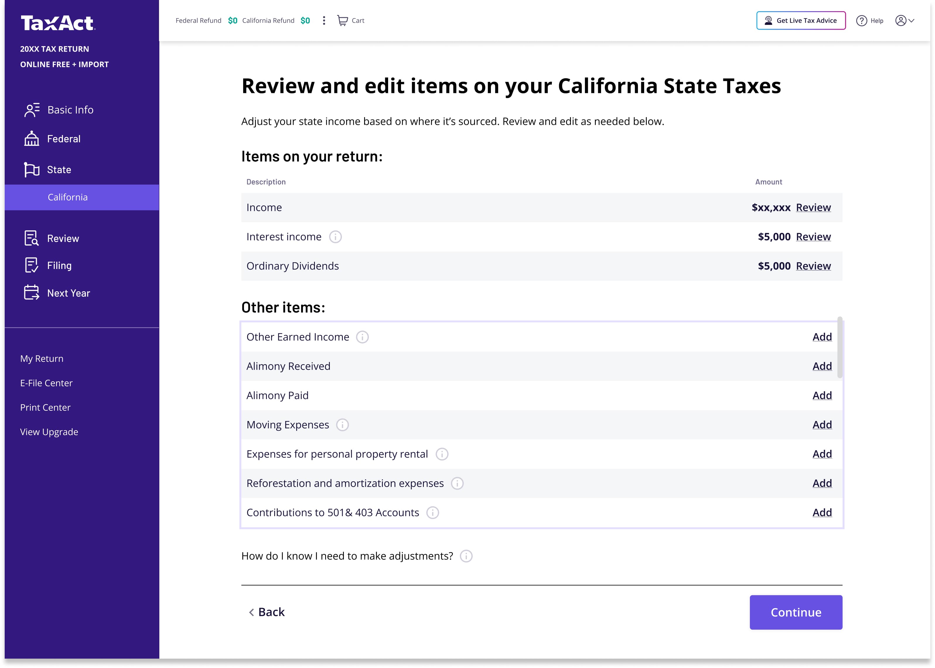
What the review hub unlocked
Clearer hierarchy
Users only see subjects that matter to them. Everything else stays out of the way.
Sense of place
A homebase they return to after each topic. No more wondering where they are in the flow.
User agency
Choose which detours to take. Review what's relevant, skip what isn't.
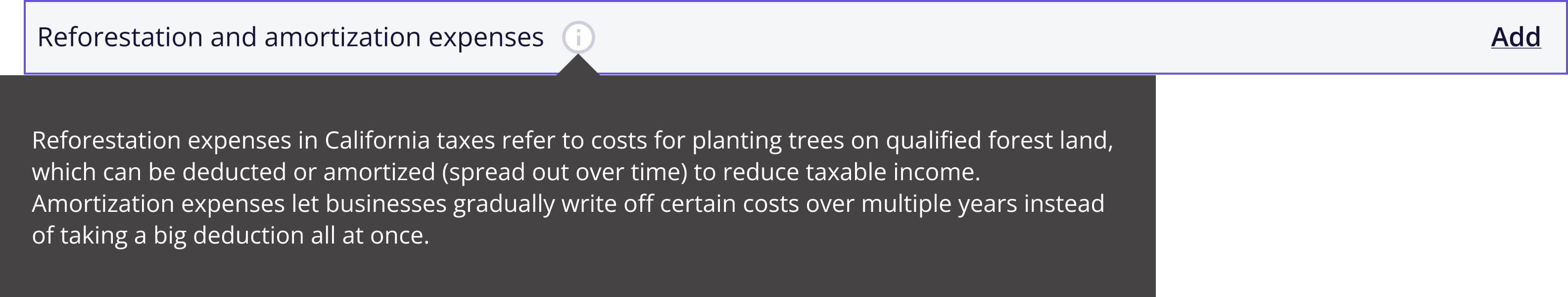
Tooltips handled the rest. Specialized topics got plain-language descriptions inline, so users could decide whether something applied without leaving the page or guessing.
Make the question work, not the user
UXBefore, every user saw every possible credit and deduction regardless of whether it applied to them. The flow didn't filter. It just presented everything and hoped users would figure out what to skip on their own.
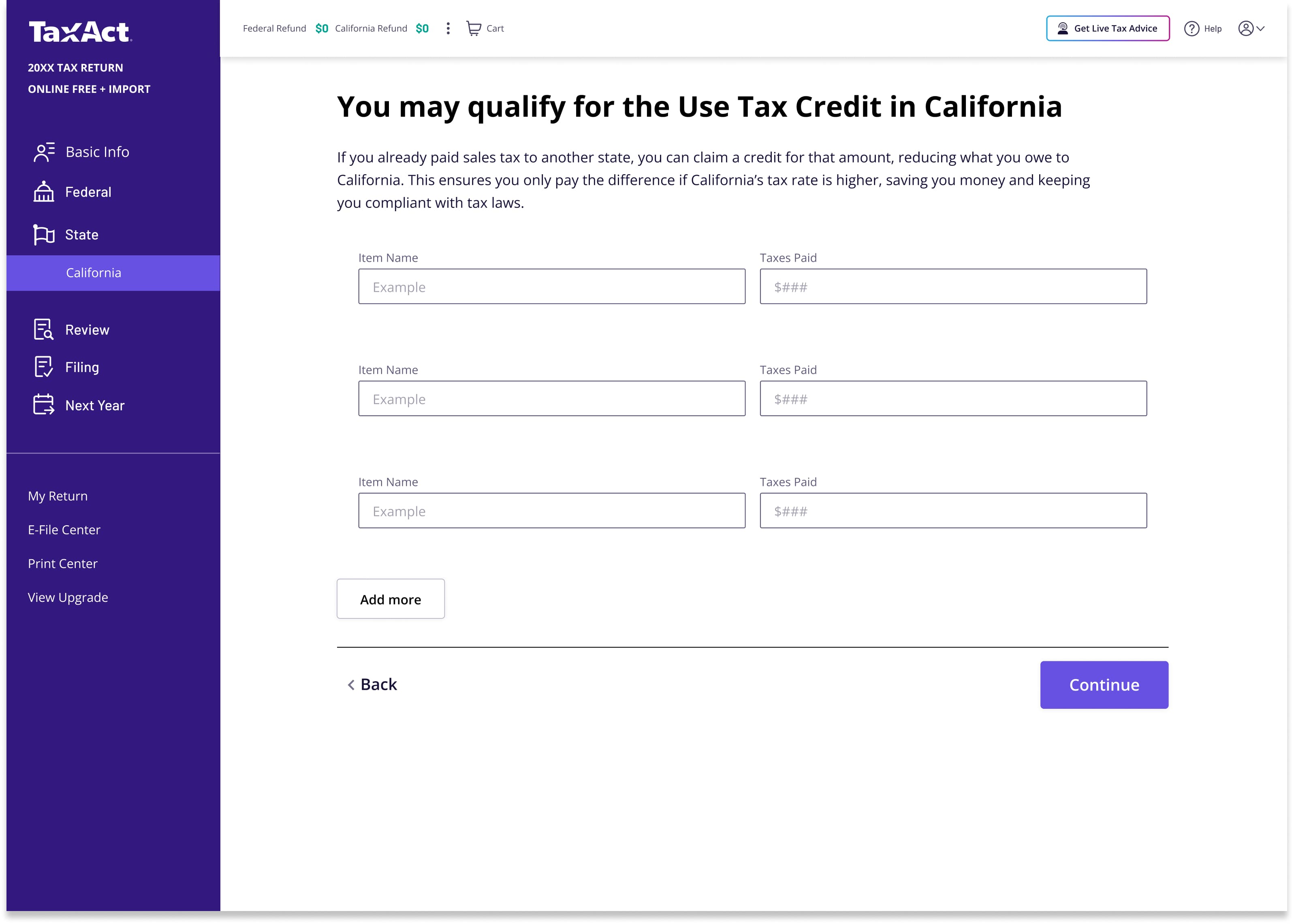
We flipped that. Instead of showing every screen and asking users to self-select out, we asked one plain-language question upfront: "Do any of these situations apply?" Check what applies, skip what doesn't. "None of the above" clears the whole section in one click.
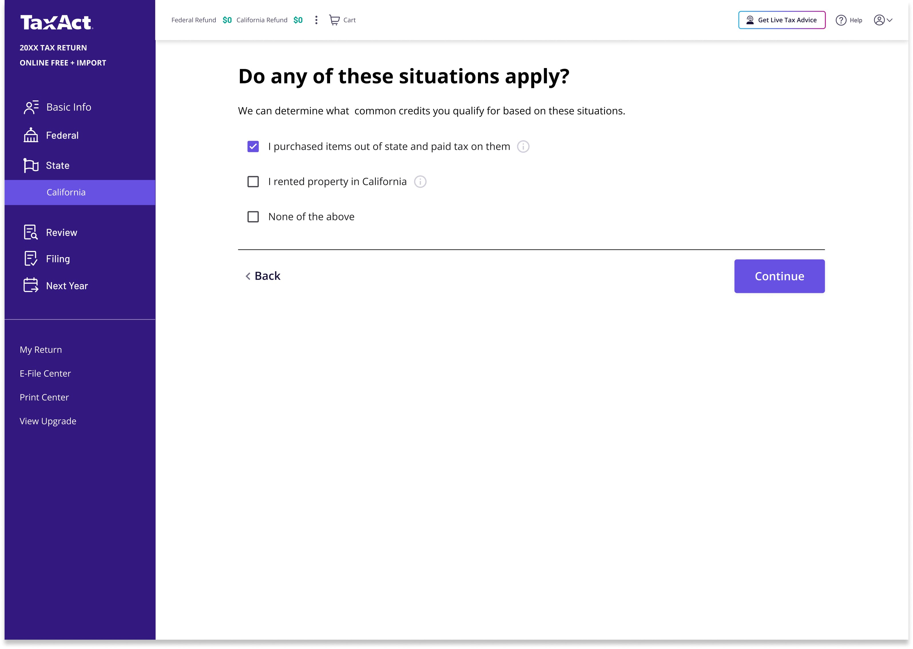
The selections drove what came next. Pick a situation, land directly at the relevant credit entry. No irrelevant screens, no dead ends, no guessing whether a topic applies.
What smarter paths unlocked
A sense of momentum
Users felt carried to the finish line. No getting stuck on repeated questions or topics that had nothing to do with their return.
A sense of respect
The program felt like it valued their time. Instead of shoehorning everyone down one path, it met each user where they were.
Did it hold up?
We tested the proposed solutions with users before writing a single line of production code. Three questions guided every session.
Three questions, three signals
Did users understand the new hierarchy?
Users correctly identified sections and understood how topics were grouped without prompting.
Could they use the Review/Add pattern?
Users intuitively distinguished between items on their return and items they could add. No confusion between the two actions.
Did they feel momentum when sections were skipped?
Users recognized they could bypass irrelevant topics. The flow felt shorter even when the same number of required screens remained.
The homebase pattern we tested
Three for three. The momentum that had been dying at step six was carrying through to the end.
Two states turned into five
The project started with New York and California. When the business saw early results and the efficiency of our approach, scope expanded to include Ohio, North Carolina, and Georgia. Five states, each with its own tax code and its own edge cases.
That could have derailed the timeline. Instead, the team absorbed it.
Daily triad meetings kept TaxDev, Product, and UX aligned on blockers and decisions. Weekly huddles with the broader dev team caught issues before they compounded. The California pattern we had built became a systemic template that we could configure for each new state instead of rebuilding from scratch.
RDP + Military rules
City returns
School district returns
Unique credit structures
Deduction structures
Adding a state wasn't starting over. It was configuring a known pattern. That's what made the expanded scope possible on the original timeline.
4x
We targeted 2%. We hit 8.7%.
Four times the goal we set. The conservative target turned out to be the smartest decision we made, because nobody could discount the result.
- 8.7% improvement in state completion rate
- 90% reduction in the number of screens users saw
- 42 months of engineering work saved through the template approach
- Expanded from 2 to 5 states on the strength of early results
Information architecture isn't visible to users, but it's the first thing they feel.