← Work/2025
Optro Scenario Planning
From intuition to simulation
- Role
- Senior UX Designer
- Year
- 2025
- Tools
- Figma · Replit · Enterpret AI · FigJam
Impact
- $1.4M in pipeline generated by market response
- $240K ARR converted from pilot users
- EMEA expansion unlocked by the new capability
- Forrester recognition in the GRC space
Sound data, two different audiences, no shared language
Being a Risk Manager means you're already thinking like a statistician, consistently surfacing potentially disastrous scenarios with credible work behind each one: identifying causes of risk, mapping prevention and mitigation controls, and pointing out possibly catastrophic consequences to the people who fund your department.
Folks in the boardroom don't speak your language. They speak in dollars and ROI, while you think in ranges and probabilities.
This was the reality facing Optro's customers. Rigorous, statistically sound work that fell flat in the boardroom because of a language barrier.
The gap wasn't knowledge. It was language.
The Scenario Planning brief I inherited at Optro was straightforward: make it work. But what does that mean? How might we turn Scenario Planning into a bridge between two different groups, not just another feature? That was the question I carried into the project as design lead.
Noisy research and how I found the problem signal
As the design lead on this project, I had ownership over the interaction model, visuals, simulation approach, and data reporting structure. But this wasn't a solo effort. I worked alongside immensely talented peers: my PM, the UX Research team, and our engineering partners. One of them, our Lead Engineer, was the team's simulation expert.
Speaking of the UX Research team, they had a mountain of data points coalesced when I stepped into the project. The issue was that it felt like a lot of noise, and we needed to ask the right questions to find the signal. Familiar with this kind of data noise and ambiguity, I asked, "What are the most important pieces for identifying the problem here?" From that filter, three clear patterns emerged and guided us through the rest of the project.
Risk Managers and executives speak different languages.
Same risk, two vocabularies. The gap to close was syntax, not knowledge: qualitative shape on one side of the table, dollars and ROI on the other.
Single numbers scared them. Ranges set them free.
Risk Managers think statistically. They just don't want to commit to one number and stake their credibility on it. Ranges were the pressure valve. They gave Risk Managers room to be uncertain and gave the Monte Carlo engine the richer input it needed to run accurately.
A forecast nobody can interrogate is a forecast nobody trusts.
Executives wouldn't act on a black-box number. The output had to show its math: which cause drove the result, which control suppressed the tail, which consequence dominated the distribution.
Five directions explored, and why four didn't hold up
Our competitors leaned into some specific data visualization methods, but would they work for our users? Our users think in strong visuals, but more importantly, they think in relationships. No items in a risk library exist in their own universe. They're part of a larger ecosystem. After exploring these models and cross-comparing the pros and cons of each against our users' mental model, one direction stood out.
Spider / Radar
Visual clutter obscured the relationships between cause, control, and consequence.
5×5 Risk Matrix
Too high level. The subjective labels lost the nuance Risk Managers care about.
Gantt Timeline
Over-indexed on process. Risk trade-offs happen simultaneously, not sequentially.
Fishbone Cause
Couldn't integrate qualitative and quantitative narratives in one read.
Bow Tie
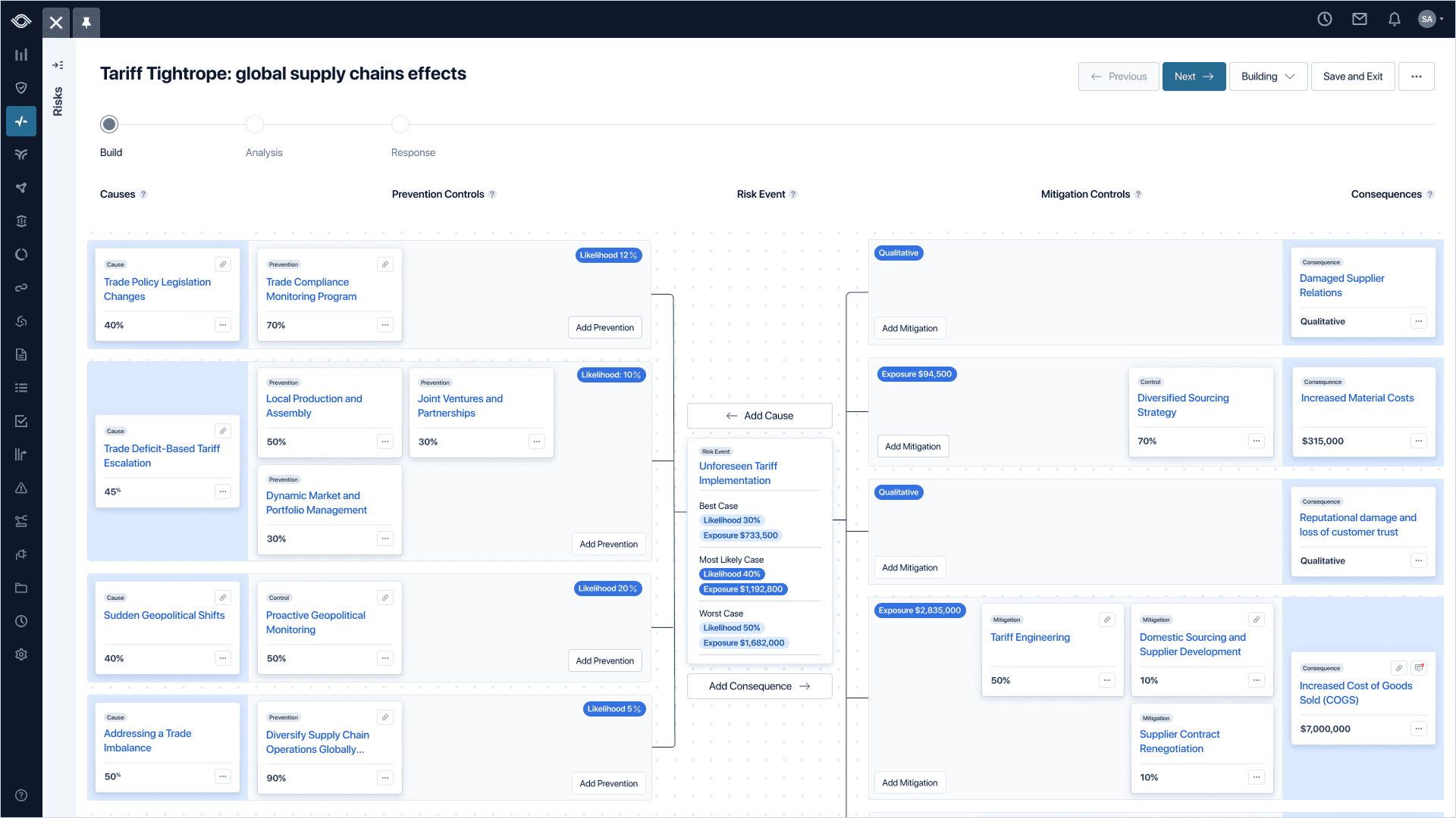
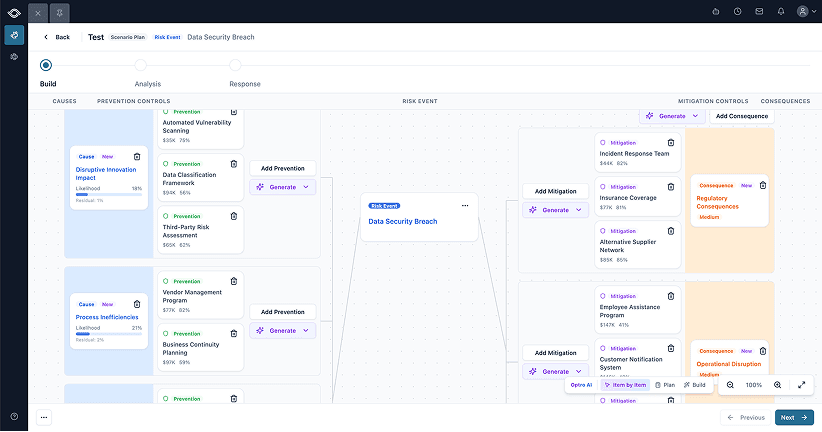
ChosenMapped cleanly to the way Risk Managers already think on whiteboards.
The bow tie was the only choice that made sense. It told a visual story of data nodes feeding into a central "knot," emphasizing the relationships our users are already thinking in. Causes feed an event on the left, consequences fan out on the right, controls clamp both sides. It didn't hurt that it was also a familiar pattern in the GRC space for thirty years.
Wizard vs. Canvas, and the binary option trap
The right data model had been chosen, but how would a user interact with it? Two different approaches were obvious to me, but they weren't without their tradeoffs.
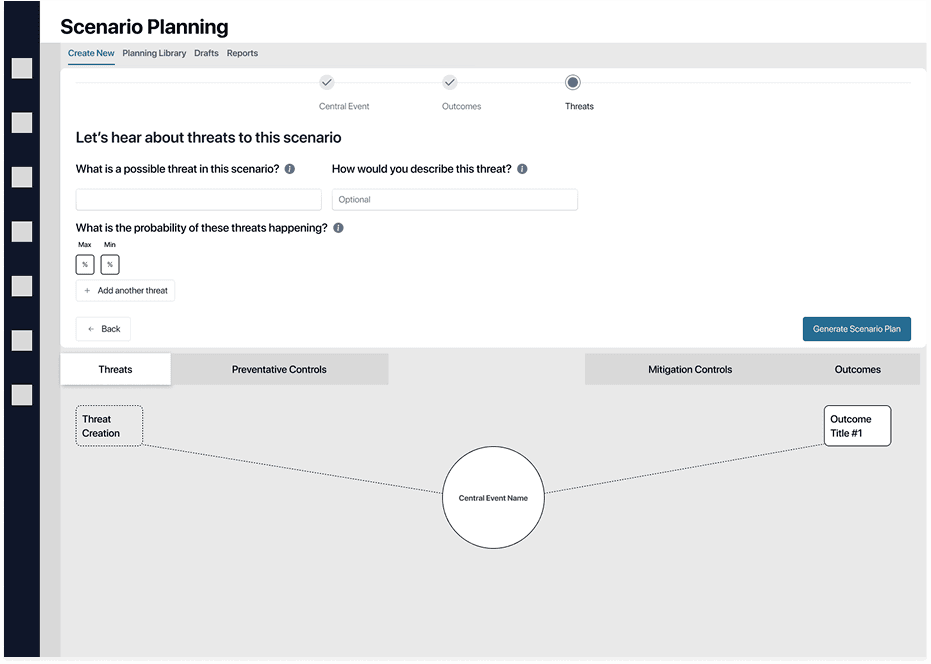
After some initial concept testing with users, a confusing result came back: users didn't have a strong preference for either. Neither option gave them the confidence that this was a tool they could bring to the boardroom. That's when I realized I had trapped myself in either/or thinking.
I didn't need to accept the tradeoffs at face value. There was a third way. I could keep the full bow tie canvas in view so users never lost context, then use a modal for focused input when they needed to act. This kept users grounded in the larger story while giving them a focused space to work without feeling overwhelmed.
Wizard
- Step-by-step guidance
- Splits attention
- Cramps the canvas
Canvas
- Full picture at a glance
- Easy to get lost in
- Data entry breaks the view
Canvas + Wizard
Chosen- Canvas for the overview
- Wizard only for heavy lifts
- One decision at a time, in context
Going from a blank page to a dataset in moments with AI
While V1 research was underway, we were already noting opportunities for the next version. One clear opportunity emerged: users need momentum to get started. Mature Risk Managers aren't intimidated by blank pages, but less mature orgs need that momentum to get the most out of Scenario Planning.
Risk Managers upload an existing policy or incident report. We extract causes, events, consequences, and controls into a draft bow tie they can edit. The blank page is gone.
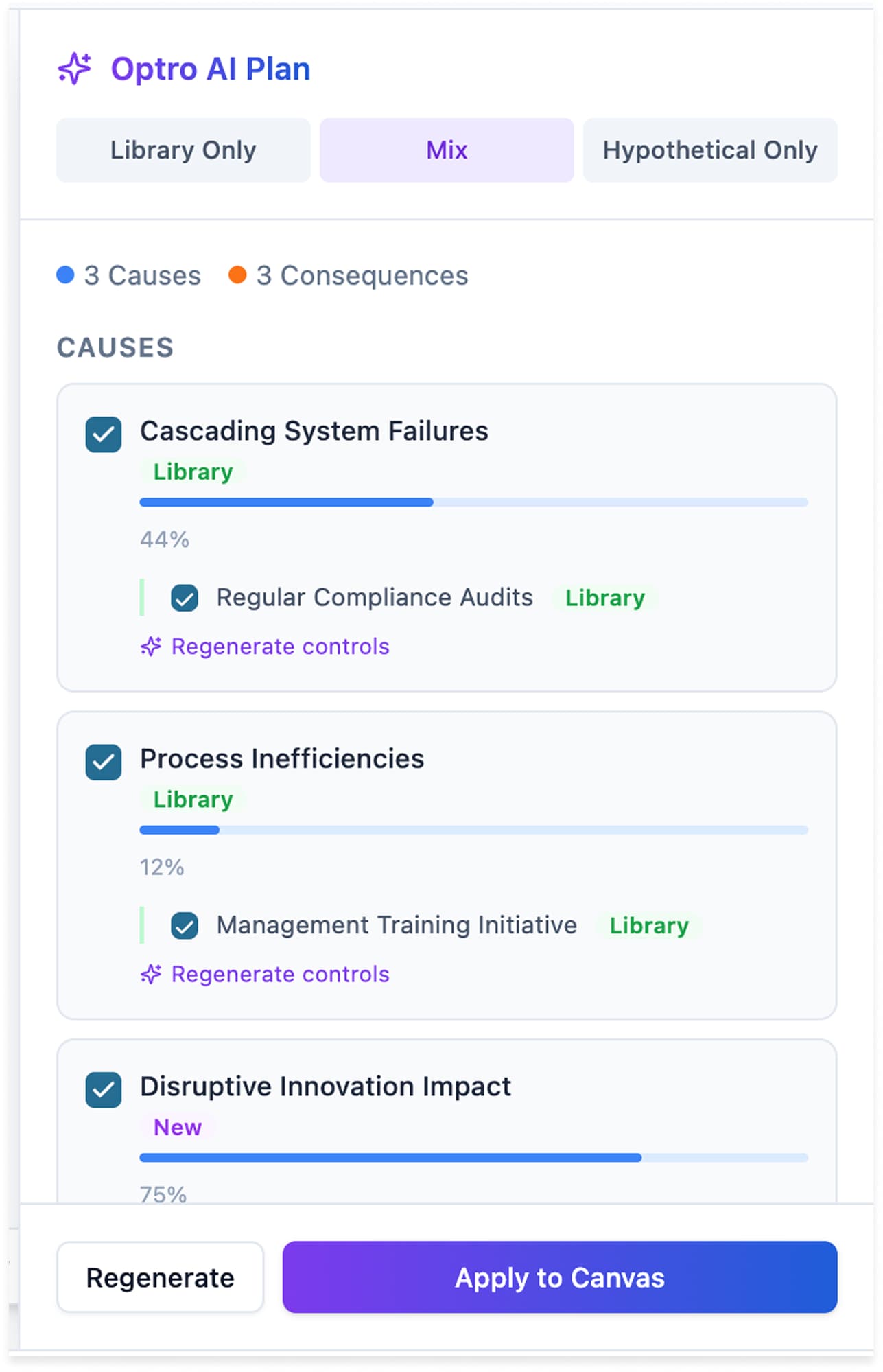
V2 generates the bow tie itself. I designed three approaches to integrating the AI, so the Risk Manager always picks the level of involvement. Prototyped in Replit.
With momentum in mind, we had two guiding principles as the V2 designs took shape:
- Avoid the blank page problem. Make it as easy as possible to get reliable, AI-generated data into the canvas.
- Keep the human in the driver's seat. We needed to meet users where they were on an AI adoption and trust curve, and give them multiple ways to engage with AI-generated data at their own comfort level.
Most user control
Item by Item
The Risk Manager generates one node at a time, in place. Best when the scenario is half-known and the AI is filling specific gaps. Slowest in raw output, but the user is in command of every piece.
Balanced
Plan Mode
The AI proposes a structured plan; the Risk Manager checks what to apply before anything lands on the canvas. The second axis of control lives here (Library Only, Mix, or Hypothetical Only), so the Risk Manager scopes the AI's imagination to what the scenario calls for.
Most AI control
Build Mode
One-shot generation of the entire bow tie. Fastest path from blank to draftable. The Risk Manager edits after the fact rather than directing the AI in flight, useful when the scenario is well-known and the goal is a starting point fast.
Meeting users where they are
Our solution was to offer a range of ways to interact with AI, from hands on to fully hands-off. We couldn't force someone into using AI and risk losing their trust in the product if they weren't ready for it. We needed to respect where users were on their journey.
Item by Item
“I'll drive. Suggest one node at a time.”
Plan Mode
“Propose a plan. I'll review before it lands.”
Build Mode
“Build the bow tie. I'll edit after.”
Inside any mode (Item by Item, Plan, Build) the user can guide the AI with a Focus Prompt. This lets the Optro AI know what the Risk Manager would like to emphasize in the generated data, whether sourced from their existing library or net new.
Build with Optro AI
Select a data source and optionally provide focus areas for AI generation.
Library Only
Use curated items
Mix
Blend sources
Hypothetical Only
AI-generated
Focus Prompt (optional)
Cancel
The curveball in user thinking that almost killed the simulation
The relationship-clear UI was only half the battle, but it would be useless without an accurate simulation system to back it up. This is where the Monte Carlo Simulation came into play. However, for Monte Carlo to serve up a four-course meal of reporting and simulations, it needs an ingredient list. That's where we ran into issues.
- 1
All good
Cause 1
Likelihood ##%Prevention Control 1
Strength ##%Mitigation Control 1
Strength ##%Consequence 1
Exposure $####All good
Risk Managers expect every object to have data behind it.
- 2
Curveball
Lowest
Median
Highest
Curveball
Risk Managers think in 1–5 scales, not percentages. Exposure ranges feel natural to them; likelihood and control strength don't.
- 3
Dead on arrival
Best Case
Likelihood ##%Exposure $####Most Likely Case
Likelihood ##%Exposure $####Worst Case
Likelihood ##%Exposure $####Dead on arrival
Shaky confidence in the inputs means shaky confidence in the outcome. If the data feels wrong, the simulation does too.
Step one was fine: Risk Managers already expect every object to have data behind it. Step three was a known property of the simulation, best-case, most-likely, worst-case outputs.
Step two was the curveball putting the project in jeopardy. Monte Carlo needs ranges, and ranges need percentages. Exposure ranges felt natural for users, as Risk Managers price out dollar bands all day. Likelihood and control strength were another story.
We faced a domino effect: force users into raw percentages for something as vague as likelihood, and the inputs would feel wrong; once the inputs feel wrong, the simulation is dead on arrival for Risk Managers and executives interrogating its credibility.
How I solved the curveball
I kept the label on the front and the percentages underneath.
Likelihood to happen this year
- 1. Very UnlikelyVery unlikely to occur in the next 12 months
- 2. UnlikelyUnlikely to occur in the next 12 months
- 3. PossiblePossible occurrence in the next 12 months
- 4. LikelyLikely to occur in the next 12 months
- 5. Extremely LikelyAlmost certain to occur
Pick from the 1–5 scale Risk Managers already use
Likelihood to happen this year
Possible the risk may occur in the next 12 months
One label selected
Generated range
Best
30%
Most Likely
40%
Worst
50%
The simulation runs on the range. The user never sees a sigma.
Range generated for Monte Carlo
Users pick from a familiar 1–5 scale, the language they already use. Each label maps to a generated range that feeds the simulation. The math gets richer inputs; the user never feels like they're guessing a single "right" answer.
The lesson I took from this: a small change at the input layer made a much bigger change at the output. The 1-5 scale felt like nothing to the user, but it gave the simulation richer data than a single percentage ever could.
The unlock: an output both rooms could read
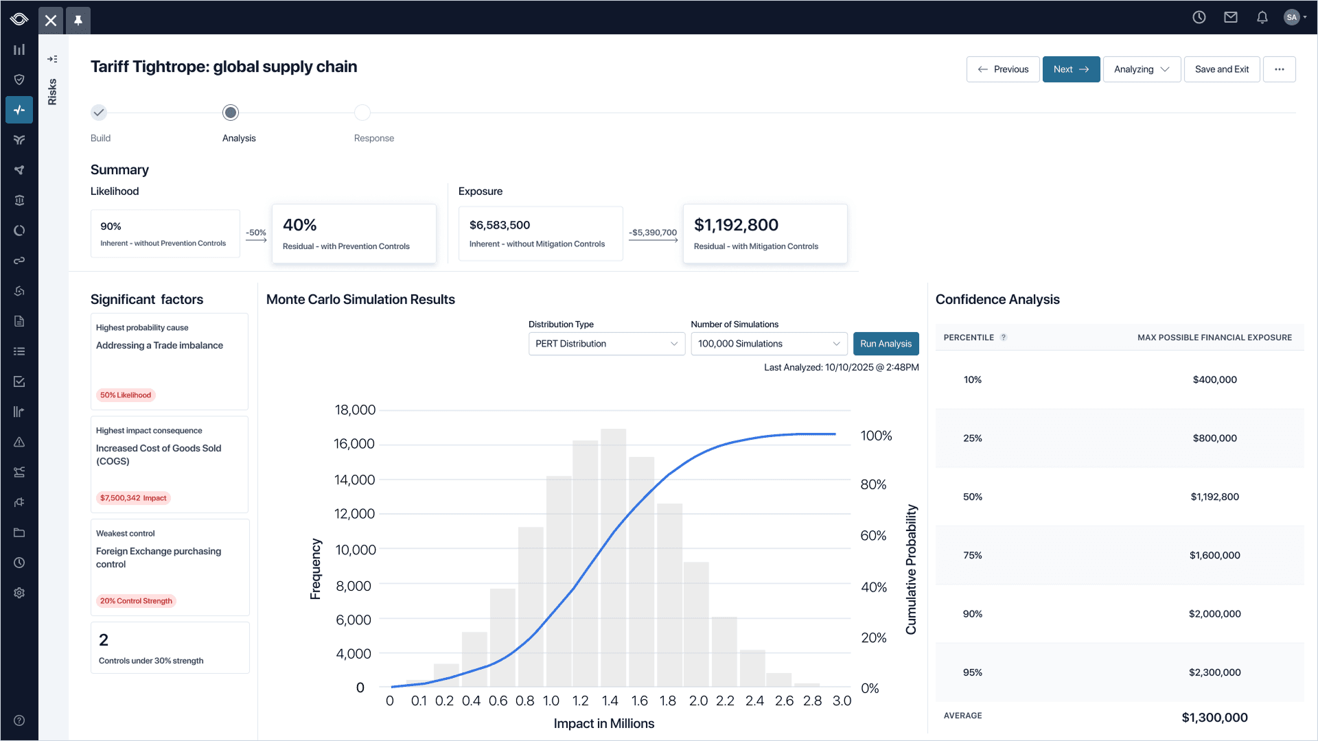
This is where the original problem started to resolve. Risk Managers and executives had spent years talking past each other. The analysis view became the room where the languages met.
Getting there meant partnering closely with our Lead Engineer, the team's in-house Monte Carlo expert. We worked in lockstep for the entire project: I'd bring a layout, flow, or wireframe, and he'd pressure-test whether the designs accurately represented the math. He'd surface a distribution property, I'd find a way to make it readable. The analysis page was the product of that very close loop.
Inputs the user understands
DesignFamiliar 1–5 scales, plain-language labels, and verify-over-input patterns. The Risk Manager never feels like they’re guessing.
Simulation users can trust
Lead EngineerMonte Carlo engine, probability distributions, and range math. The numbers underneath hold up to scrutiny.
Analytics page that tells the story
SharedPercentile tables, S-curves, and leading indicators. An output both the Risk Manager and the CFO can read in the same room.
The team landed on three things so the simulation could be defended by Risk Managers and understood by executives, in the same view:
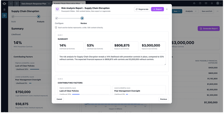
- Percentile tables for probability confidence. "P50 is $175K, P90 is $210K." This combined the languages of Risk Managers and Executives in the same sentence.
- S-curve graphs for credibility. The shape of the distribution unlocked a visual that enabled Executives to finally see the story Risk Managers were telling.
- Leading and lagging indicators for direction. Which way the overall risk and potential exposure were moving and, most importantly, what was moving it.
Risk Managers stopped agonizing over a single number, while Executives stopped second-guessing the math. This was the moment it started working.
What customers said
This brings credibility to my job.
Risk Manager
I have been looking for something like this for years.
CyberRisk Manager
You don't know how hard it is to get executives to understand these things. This changes that.
Risk & Audit Manager
I need this. Now.
Audit Manager
Reporting that sets up conversational success with AI
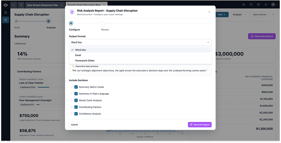
The same V1/V2 pattern showed up on the reporting side. V1 was about getting the data into one place for Risk Managers to see the story. V2 is all about making sure Risk Managers get to craft the conversation around the story. V2 introduces an AI tool that generates the output document to fit the room: PowerPoint slides, Word docs, or emails. The user picks the format and sets a guiding tone, and the tool crafts the artifact around the simulation data.
Every input for a scenario now lives in one flow. Causes, controls, the simulation, and action plans stopped scattering across spreadsheets, decks, and emails. Before V1, just getting the data unified inside one product was the win that made everything downstream possible.
The reporting flow itself, prototyped in Replit. Risk Managers pull the right artifact for the right room straight out of the simulation environment, designed against three rules.
Three rules that guided V2:
- Reports start at the source. No copy-pasting between tools. The pipeline from analysis to tangible artifact should be frictionless.
- The right format for the right room. Slides for executives, an email for the quick update to a colleague, a Word doc for the team meeting. Different rooms call for different formats, but the same data should feed all of them.
- Curated data that drives decisions, not data dumps for the sake of it. Risk Managers should be able to shape the story before the meeting, not improvising the story while in it.
From a system of record to a system of action
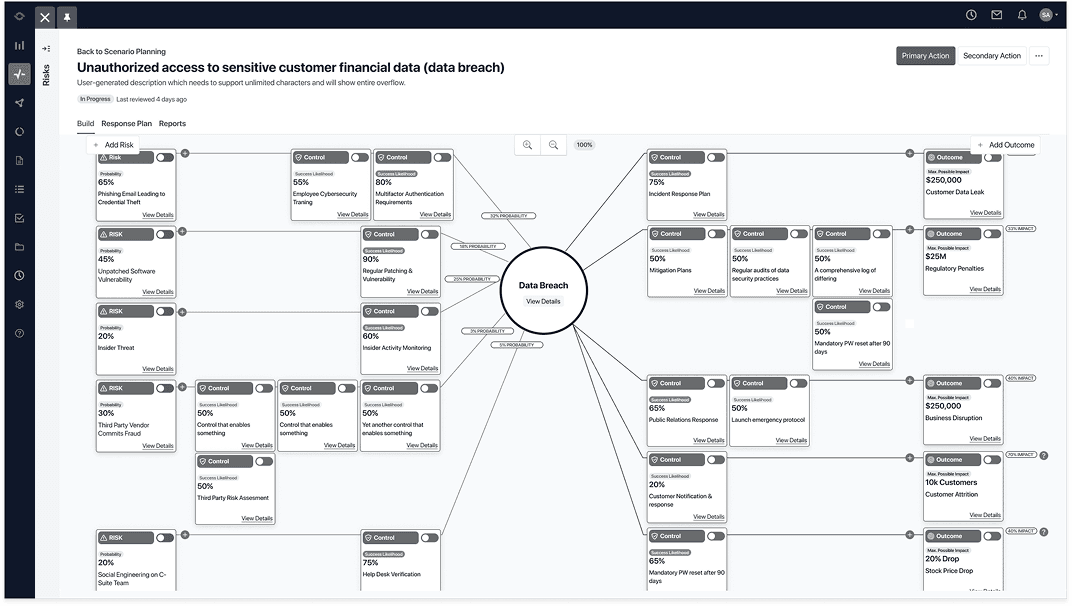
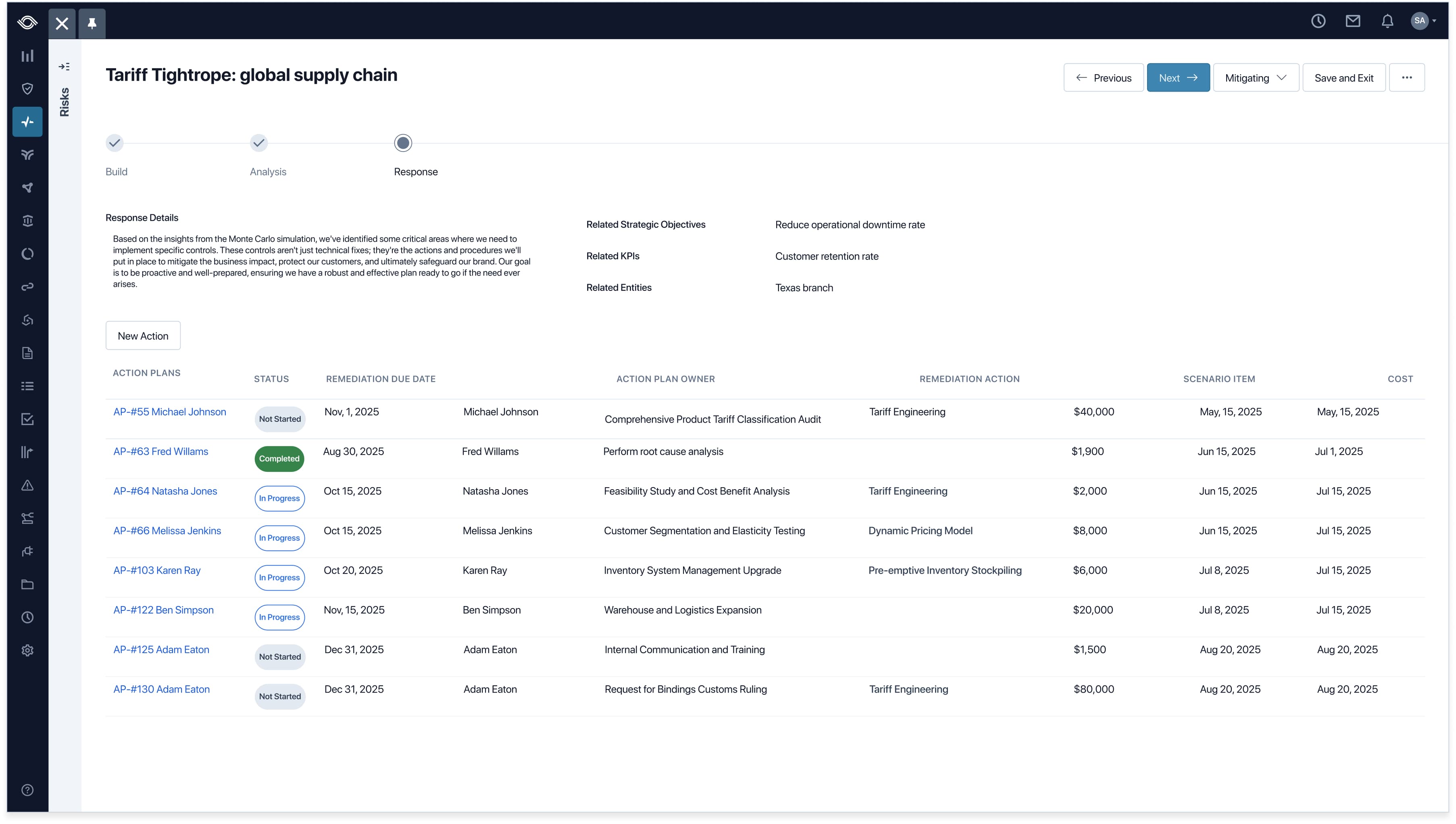
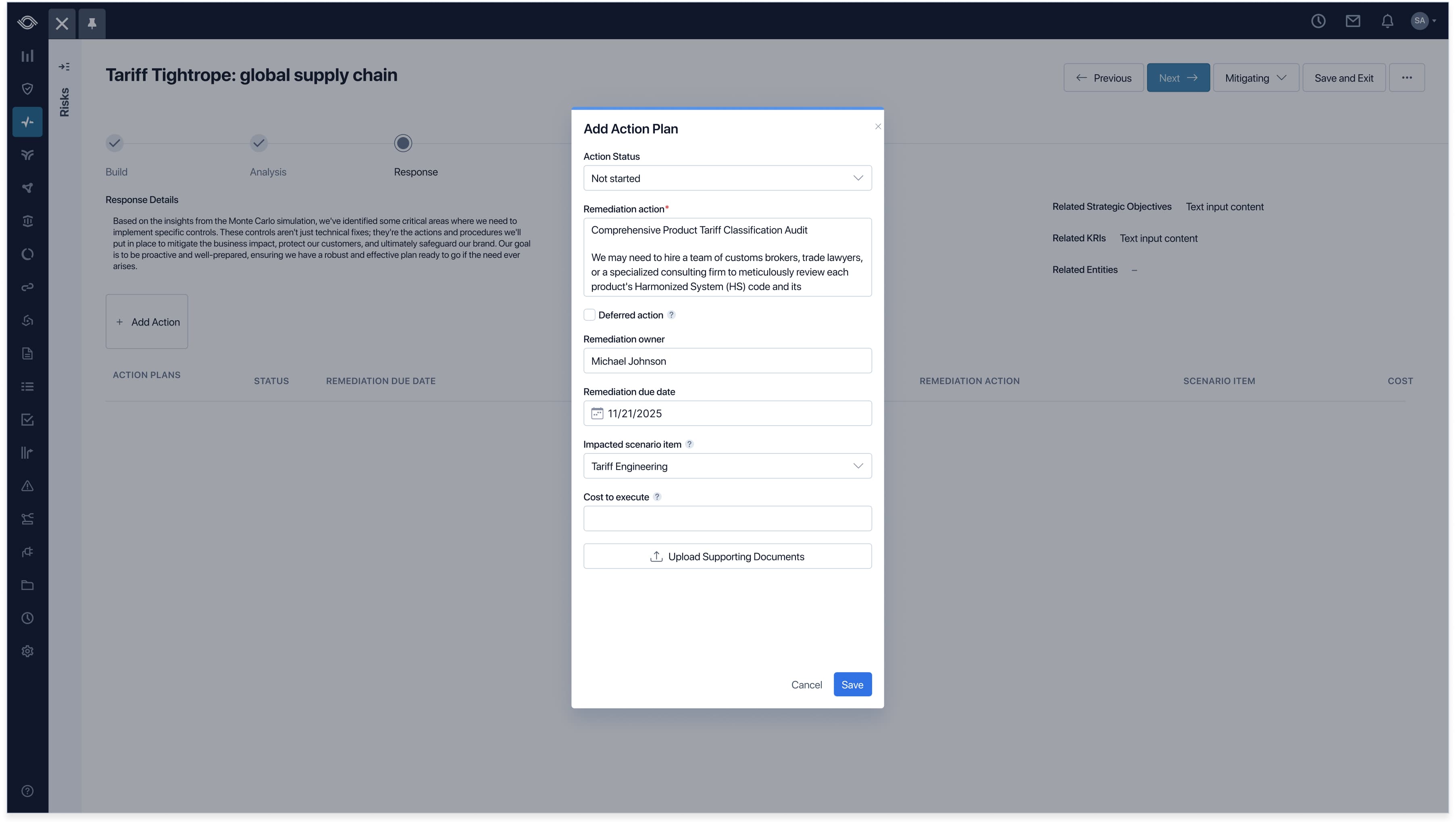
Reviewing simulation results is only half of a Risk Manager's job. They review the data, but the real job is proposing what to do about the picture a simulation paints. Pulling the action proposal step away from the scenario that prompted it would have been disorienting, so the Response side of Scenario Planning lives inside the same flow. Action plans stay rooted in the analysis that produced them.
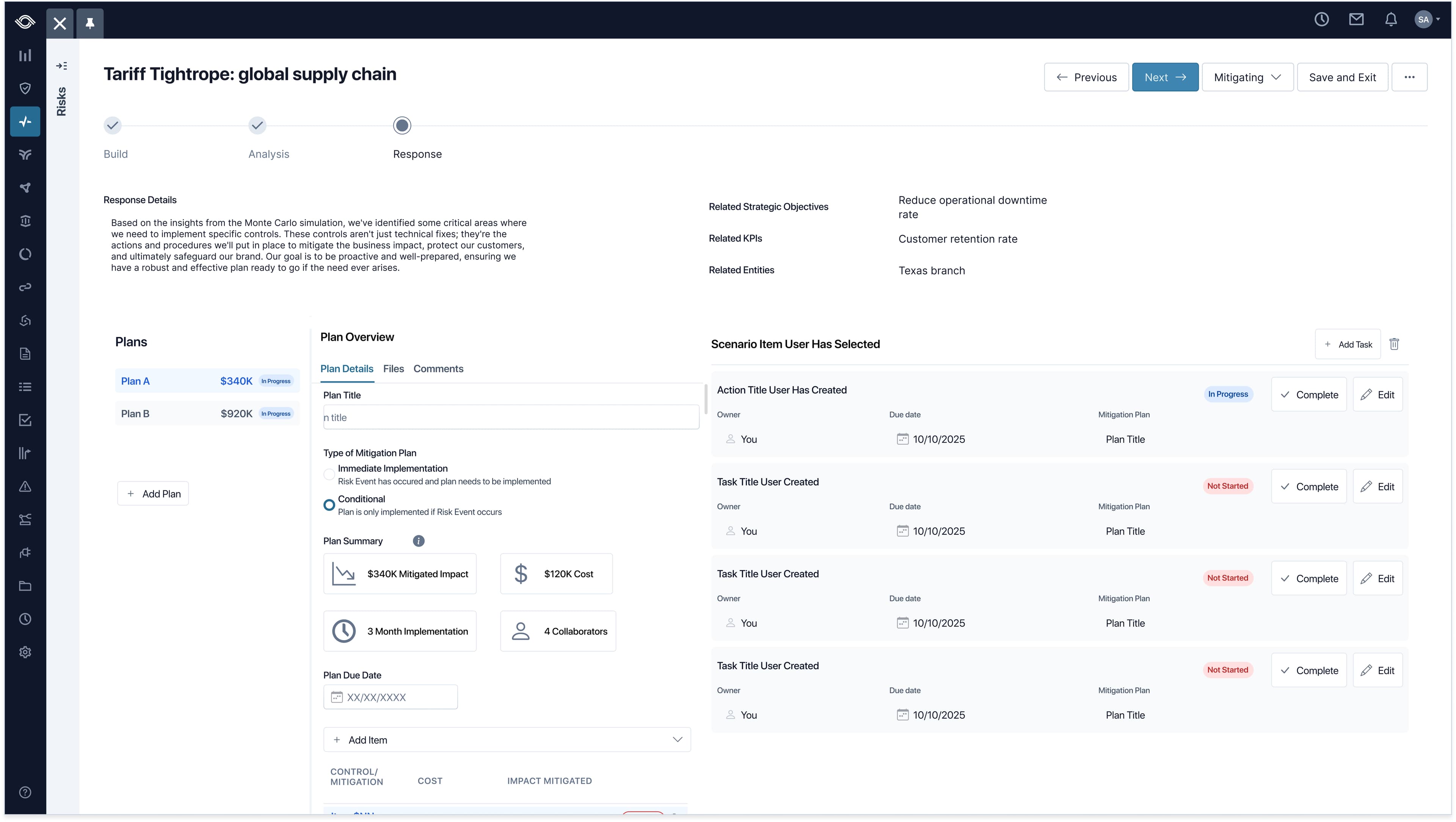
Action Plans live inside the Response step. Each one links back to the scenario item that prompted it, with status, remediation owner, due date, cost, and impacted scenario item all on the same row. The chain from analysis to action stays intact in a single view.
Risk Managers propose multiple plans side by side, each with its own cost rolled up for executive review. Plan summaries surface impact, cost, timeline, and collaborators at a glance, and tasks roll up to their parent plans and back to the original scenarios, keeping strategic decisions grounded in the analysis.
Pipelines don't lie
The brief was "make scenario planning work." When all the dust settled, the user tests wrapped up, the user stories were written, and the last line of code was shipped, we had to ask ourselves: did it work? The results spoke for themselves: financial gain, expansion into EMEA where scenario planning regulations are standard, and recognition from some of the most respected voices in our industry.
- $1.4M in pipeline from market response
- $240K ARR converted from pilot users
- EMEA expansion unlocked by the capability
- Forrester recognition in the GRC space
Where I'd push harder
Validate sooner
At one point I caught myself pixel-pushing, seeking perfect spacing and color before I'd validated the approach. The polish was burning runway I didn't have.
Collaborate more frequently
When I got stuck, a colleague's perspective almost always showed me I was zoomed in too far.
Test interaction patterns on data-dense screens
I hit a point early in the bow tie decisions where I was getting so lost in the presentation of data that I didn’t do enough testing of how users interacted with the data. This ended up costing extra time in user testing and was easily avoidable.
Same room, shared math
Build
Analysis
Response
The CFO still asks about dollar exposure. Now the bow tie answers in a language the room already speaks.