← Work/2024
TaxAct E-Signature Flow
Why should something take 10 minutes when it could take 3?
- Role
- Senior UX Designer
- Year
- 2024
- Timeline
- ~3 months
- Tools
- Figma · FigJam · Maze · DocuSign API
Impact
- Full e-signature capability shipped in months
- Closed the last major feature gap with competitors
- Established Design Hand Off meetings as a new collaboration model with engineering
- Ran multiple design workshops to align Product, Engineering, and Marketing
The gap everyone could see
You're a tax professional. You've been at your desk for twelve hours preparing a client's return. Everything is ready. All you need is a signature approval so you can file. Should take a few minutes.
It doesn't. It can take days. And it can't all happen inside the application you've been working in. The process can span up to four separate tools.
This was the reality tax professionals were living in. Every competitor had solved it. Intuit ProConnect had it. Drake Software had it. TaxAct users were improvising with workarounds that nobody should have accepted.
"Your competitors have it, why don't you?"
That line came up in surveys, usability tests, trade shows, and evaluations of the software. It wasn't a feature request. It was a question about credibility.
Intuit ProConnect
E-SignatureDrake Software
E-SignatureTaxAct Pro
Missing
The workaround nobody should have tolerated
Without a built-in option, tax professionals had invented their own process. And it was brutal. We pulled data from usability tests, user interviews, and surveys to understand exactly how bad it was.
Usability tests showed where the workaround broke.
We watched tax professionals navigate the signing process in real time. The same friction points surfaced in every session: context switches between tools, lost documents, and confusion about what had been signed.
Interviews revealed how much time the gap was costing.
Tax pros described spending 10 to 15 minutes per client on what should be a 3-minute task. Multiply that across a full client list during tax season and the cost adds up fast.
Surveys confirmed this was the top unmet expectation.
E-signature consistently ranked as the most requested capability in TaxAct Pro. Users expected it because every competitor already had it. The gap wasn't a nice-to-have. It was a reason people left.
The pattern was the same everywhere we looked. Print the authorization form. Leave TaxAct entirely. Log into a separate e-signature tool. Upload the document. Send it to the client. Wait days for a response. Hope the client didn't abandon the process. Then re-enter everything back into the software by hand.
When I mapped the full workaround as a flow, nobody in the room could believe what they were looking at. What should have taken minutes was taking days.
TaxAct Pro
Separate e-signature tool
Wait
Client (their side)
Tax pro retrieves signed document
Save & organize
Back to TaxAct Pro
Every handoff between tools was a place where errors crept in. Every wait was a chance the client ghosted. Every re-entry step was billable time the tax professional was burning on work the software should have handled.
Making the case
"Aren't there other big things to work on?" That was the internal question, and it was fair. E-signature was one of many requests competing for engineering time on a product with a long roadmap.
The workaround flow became the argument. When stakeholders could see a process spanning 40-plus steps across six context switches and multiple days for something competitors handled in a few clicks, the priority became hard to argue against. Competitive parity data from Intuit ProConnect and Drake reinforced it. The sales team confirmed they were hearing the gap in demos and at trade shows.
The project got the green light. Now we had to build it.
The hard parts
Getting approval was one obstacle. Building it was a different kind of challenge entirely. Four constraints shaped every design decision from the start.
Legacy UI, no time to fix it
The UI had been accumulating debt for years and it showed. We didn't have the runway to fix that and build a new capability. So we picked the fight that mattered: nail the flow, worry about the paint later.
Two audiences
Tax professionals send; their clients sign. Each side needed its own flow, its own context, its own error handling.
Immovable deadline
Tax season sets the ship date. Every week of delay was a week where the gap stayed open and competitors had the edge.
Configuration sprawl
Documents, recipients, reminders, expirations, identity verification. All necessary for tax pros. All competing for screen space.
A note on the screens in this case study: they aren't polished. That was a deliberate trade-off, not a blind spot. The existing UI carried years of tech debt and patterns from a different era. We didn't have the timeline or the engineering capacity to fix that and ship a new capability. So we chose: solve the problem users actually have. The interaction model, the information architecture, the flow between tax pro and client. That's where the design work lived. Pixels could be refined in a future release. The process couldn't.
The remaining constraints shaped the rest. The experience had to coordinate between the existing desktop interface, a DocuSign API integration, and the client's email inbox. We had the technical building blocks. The design challenge was making something sophisticated feel simple inside a product we couldn't visually overhaul.
Designing and collaborating under the clock
Not everyone was sold on the approach. Product, engineering, and marketing each had different assumptions about what this capability needed to be. Rather than designing in isolation and presenting a finished concept, I ran a design workshop early to surface those assumptions and get alignment before a single screen was built.
The workshop did two things. It gave partners a voice in the solution, and it converted skeptics into co-owners. By the time we left the room, the people who'd been skeptical were the ones defending the direction in their own standups.
One insight from the workshop shaped the entire design. We realized that how the user views the flow should drive how we build the solution. Tax pros don't think in "e-signature features." They think in terms of the task they're already doing: filing. E-signature needed to plug into the existing e-file flow, not exist as a separate destination.
That insight gave us a three-stage framework.
E-File Steps
Ingress
E-Signature Request Creation Tool
Primary Action
E-Signature Dashboard
Egress
The tax professional enters from the e-file steps they're already doing. The Request Creation Tool is where they configure and send. The Dashboard is where they track status after. Ingress, action, egress. Three stages, each with a clear job.
With the framework set, we needed a way to keep that collaborative momentum going through execution. What started as a one-time workshop evolved into recurring Design Hand Off meetings with TaxDevs, engineers, and marketing. These weren't traditional hand-offs where design throws specs over the wall. They were working sessions where the team critiqued designs together, identified where we could reuse patterns already established in the product, and flagged technical constraints before they became blockers.
The meetings changed how the team operated. Partners left comments directly in the Figma files. Engineers flagged implementation questions in context instead of filing tickets after the fact.
That cadence kept us moving fast. Shared Figma files meant engineering could track decisions in real time, and a running list of open questions got resolved in standups rather than queuing up.
The ingress: start where they already are
The tax professional is already in the e-file flow. From there, they select which forms need a signature. No separate launch point, no new navigation. The e-signature process begins inside the task they're already doing.
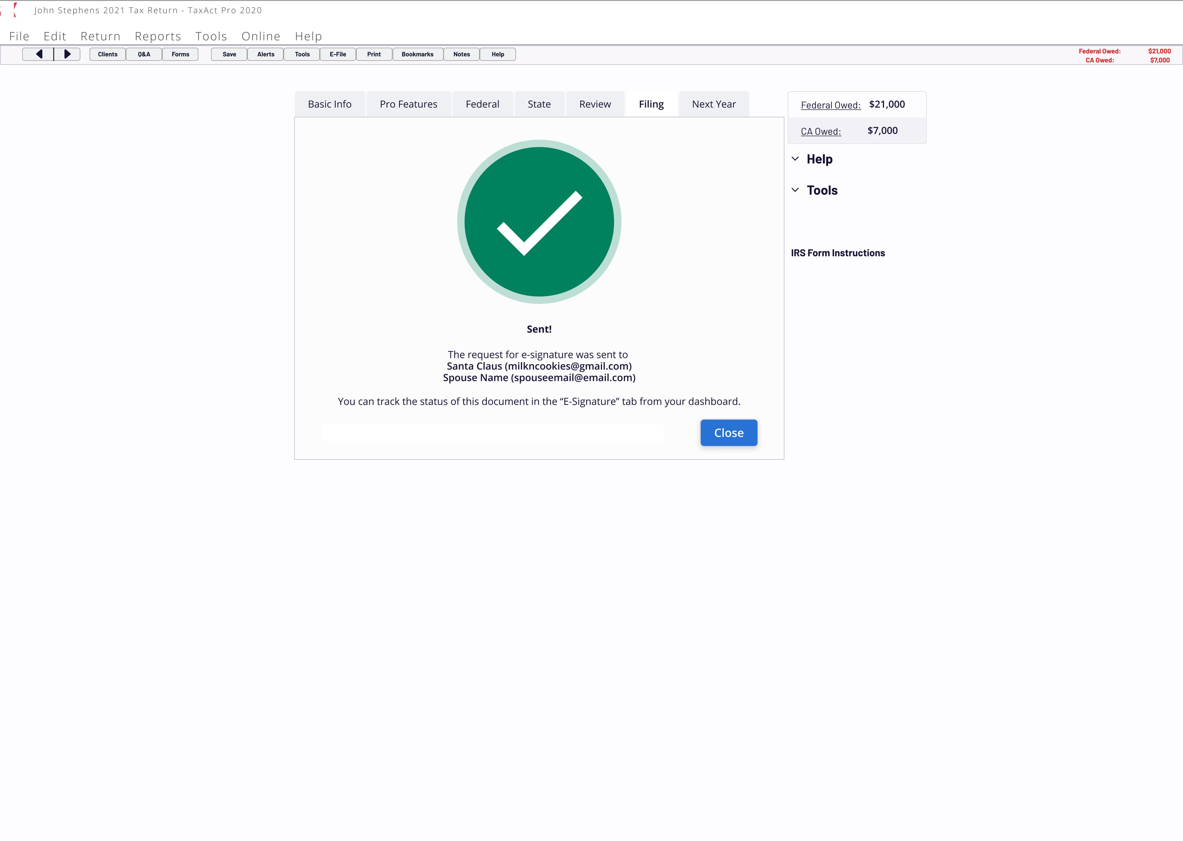
The primary action: configure and send
The biggest design challenge was the configuration screen. Tax professionals needed control over document selection, recipient information, identity verification method, reminder timing, and expiration dates. That's a lot of surface area for a flow that needed to feel fast.
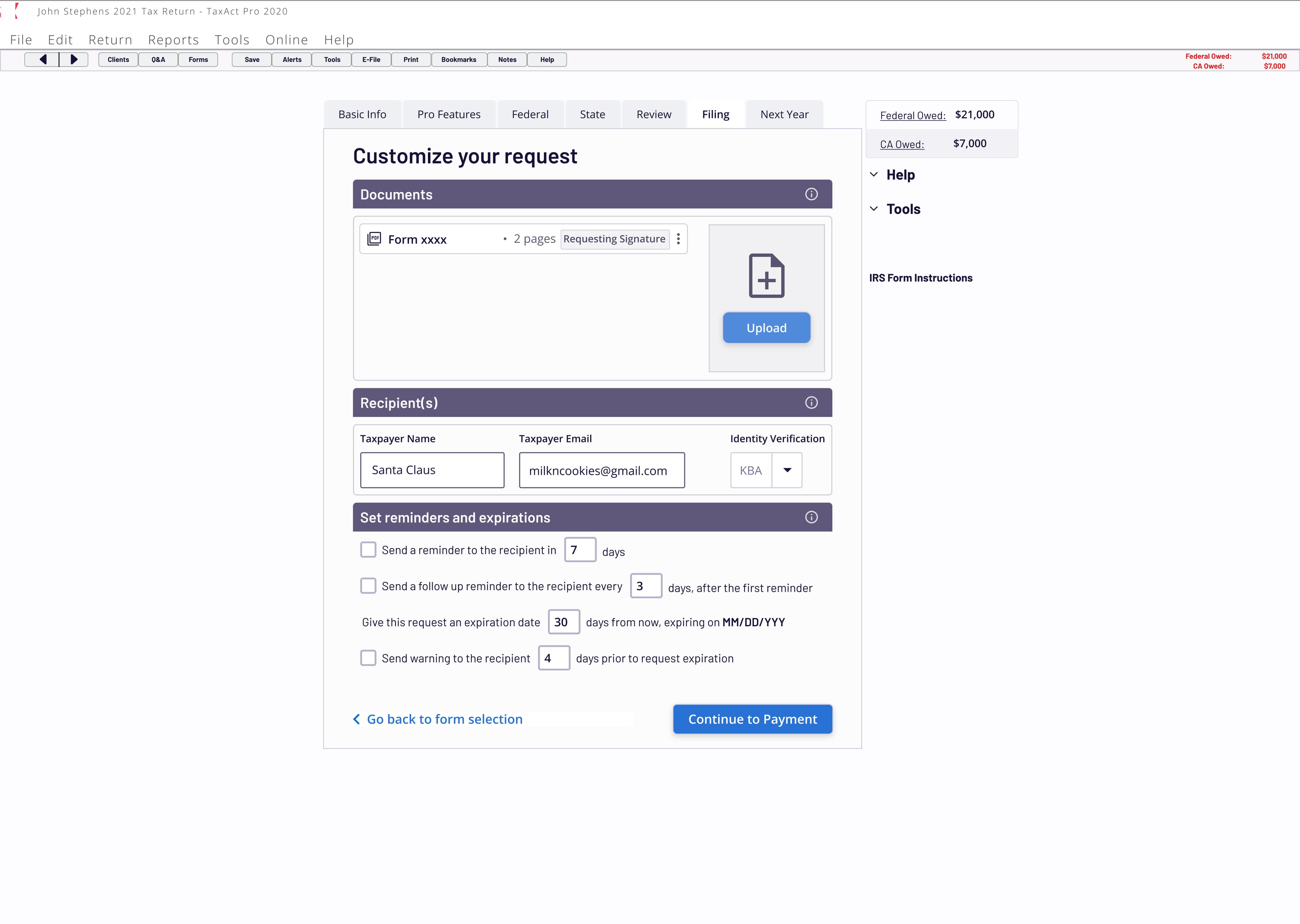
We worked through it by separating what varied per client from what didn't. Reminder intervals, expiration windows, and follow-up cadence got smart defaults that most tax pros would never need to touch. Document selection pulled from forms already associated with the return. The recipient section pre-filled from client data already in the system.
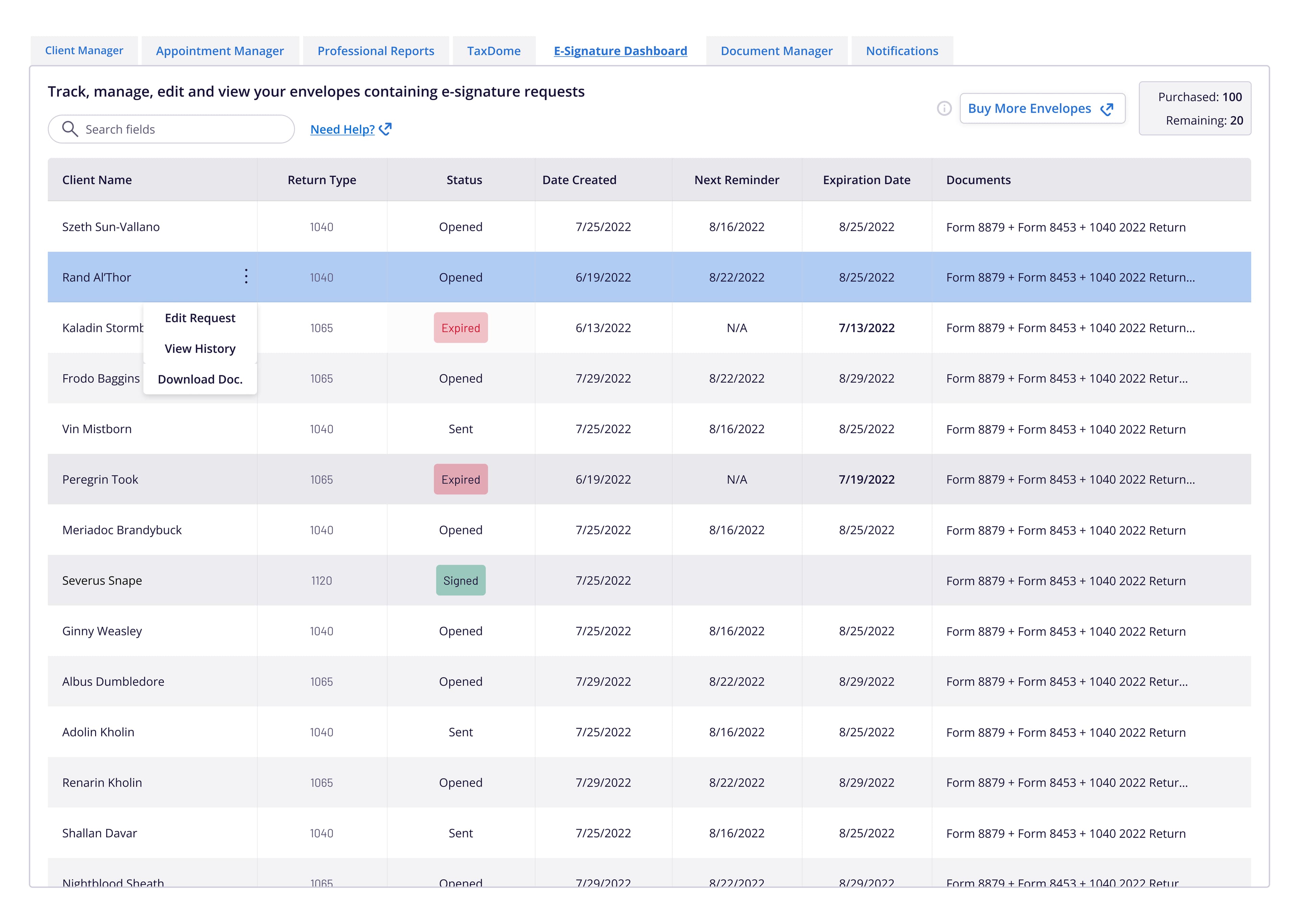
The egress: track and manage
Once the request is sent, the tax professional lands on a dashboard where they can track every envelope: who's signed, who hasn't, what's expired. No chasing emails. No wondering where things stand.
Three principles held through every iteration:
- Stay inside the product. No exports, no third-party tools, no context switches for the tax pro. The entire send-sign-confirm loop lives in TaxAct Pro.
- Minimize decisions. If the system already knew the answer, don't ask the question. Reduce configuration to only what actually varies between clients.
- Close the loop automatically. Signed data returns to the return without manual re-entry. No scanning, no saving, no re-keying.
Finally on the table
E-signature wasn't a differentiator. It was the baseline expectation that TaxAct Pro had been missing.
The value wasn't in building something novel. It was in closing a credibility gap that had been costing the product in every sales conversation and trade show demo.
The team delivered a full capability in a few months, on a timeline dictated by tax season. That mattered. Every month without e-signature was a month where competitors had an argument we didn't have an answer for.
You finish the return, ready to start the process you dread. Except you don't need to. One app. The signature is already here.