Slashing Steps,
Exceeding Goals 4x
With TaxAct
Isn't it frustrating to feel close to finishing a task, only to find you're not halfway there?
The State return is after their federal return, and uses most of the same information…so why was it 50+ screens long?
This problem caused users to stop completing their federal and state returns, leading them to leave TaxAct. If we can find a way to reduce this drop-off, we can improve our completion rate and increase revenue.
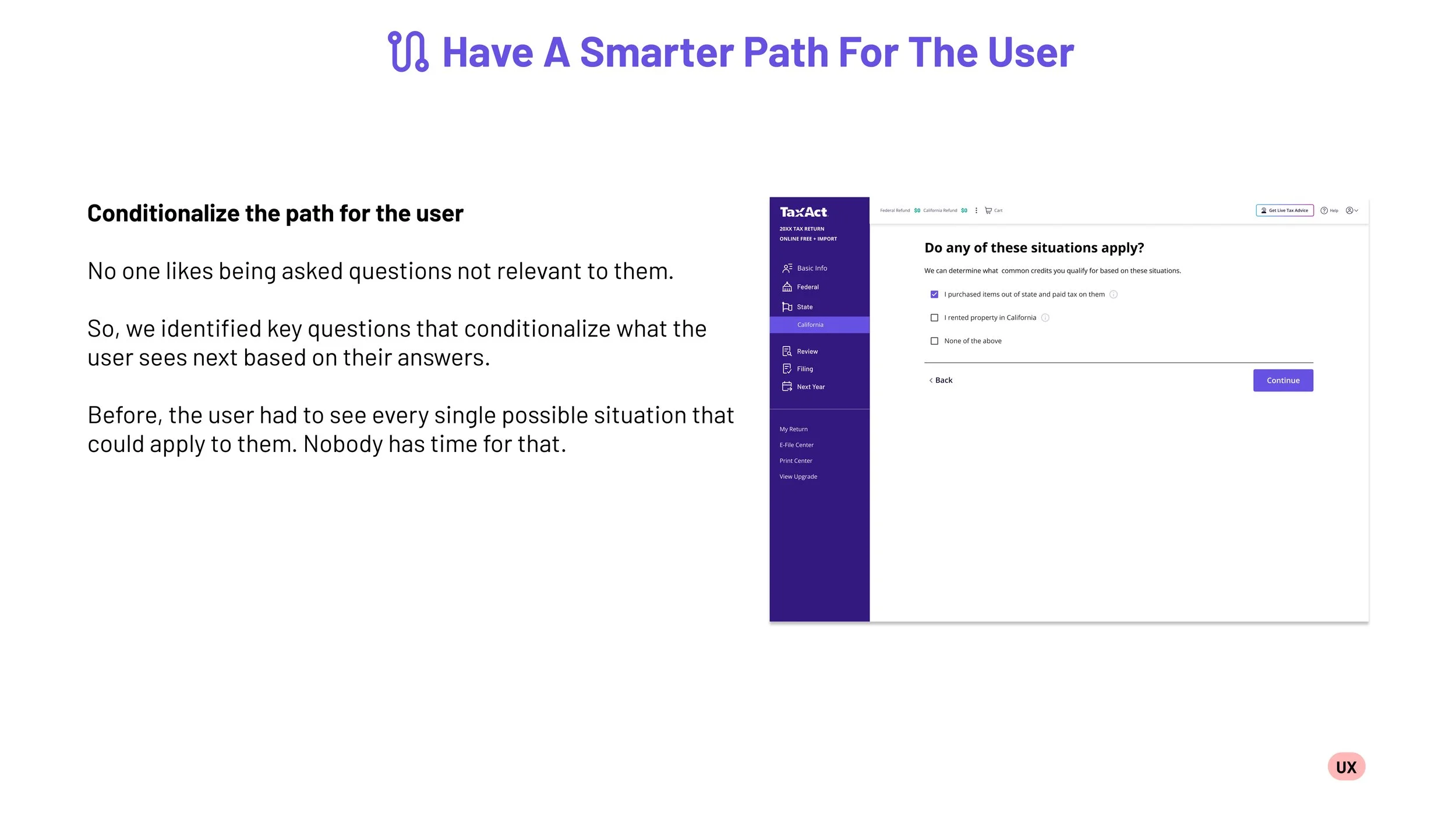
Our solution is a new Information Architecture for the State Return process that uses our technology to ask conditional questions, cut down on repetitive questions, and boost the chances of users completing the task.
Design thinking paved the way, alongside collaboration from Product, Tech and TaxDevelopers to create a repeatable template we could use for most of the states. We cut the number of mandatory screens by 90%.
Key takeaways:
Documented solution functioning as a template for most states, not just the 3 we set out to improve
Meeting our target launch date, despite limited resources
Increased Completion Rate 8.7% for Fed+State, and 1.9% for State Only users for our five most used states - the most signifiant jump in years for our product.
Sometimes less is more. And the more can be users completing.
MY ROLE
Lead UX Designer
TOOLS USED
Figma
Miro
Balsamiq
ADO
PROBLEM
There are multiple screens used in the States Flow that are redundant from the Federal Return, leading to multiple unnecessary clicks and wasted time for the user, resulting in drop off.
OBJECTIVE
If we reduce the number of drop off for the users in the first 9 screens of their state return, more users will complete their combined Federal & State returns.


